
Editing a Page
Last Update: 2 December 2025Once you’ve clicked Beaver Builder you’re ready to start working on a page. The instructions below will outline how to use the Beaver Builder tools, which include: Modules, Rows, Templates, and Saved (pre-created) Elements.
Open the Editor Window
When the Beaver Builder editor is open on a page you will see a screen similar to the image below, which includes a top bar for navigating through the Beaver Builder options and editing tools.

1. Title Bar
Indicates the Title of the page you’re working on.
2. Dropdown Arrow
This arrow will expand the Tools menu and is explained in more detail below. The options under this section won’t be used very often.
3. Status Notice
Before any edits have been made to the page this section is blank. Once you make your first change it will say “Edited”, to indicate that there are unsaved changes. If the page contains changes from previous edits that were Saved as Draft then “Edited” will also display.
4. Content Panel
Click + to expand and x to close. This is where you select a row layout, a template, and modules.
5. Done Button
The behavior of this button depends on whether you’ve made any editing changes in this session.
When the Done button is blue, there have been editing changes, and the status Edited appears to the left. Click Done to open a choice of Discard, Save Draft, Publish, or Cancel.

When the Done button is gray there have been no changes. If there are no changes, clicking Done exits the page without displaying any choices.
6. Drag icon
This icon looks like a double vertical row. Click and hold the left mouse button to drag this panel anywhere on the screen. As you drag, a blue panel opens on the left or the right. If you drag the panel into the blue area, the panel becomes pinned.
7. Modules Tab
This tab displays modules grouped into standard (built-in) and saved. There may also be groups of third-party modules, depending on other plugins you have installed. Learn more under Modules.
8. Module Group Selection
Click this box to navigate to the various module groups.
9. Search Modules Icon
Click to expand the search box and start typing a module name.
10. Rows Tab
This tab displays column layouts and saved rows, as in the following screenshot. Collapse the Columns section to see any saved rows. Drag a new row or saved row into your layout to use it. Learn more under Rows & Columns.

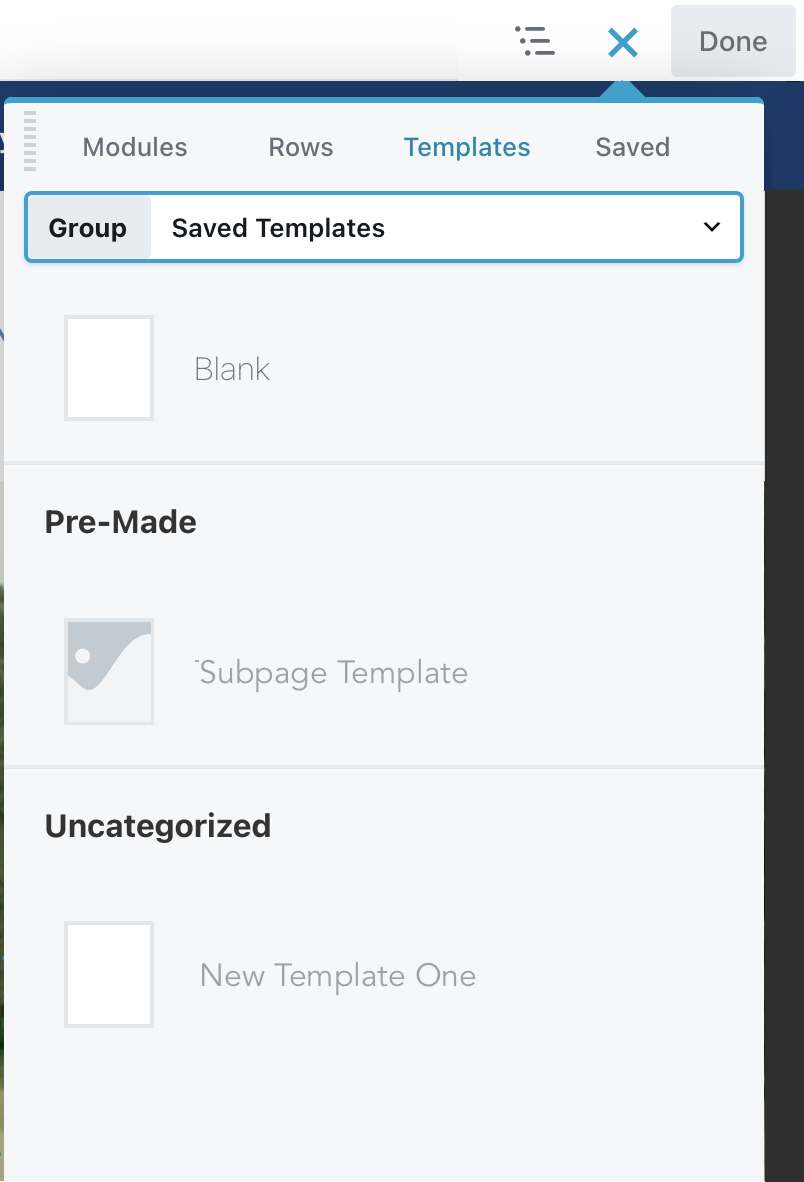
11. Templates Tab
This tab displays saved templates that can be used on any page. Select a template to add it to your page, you can choose to Replace Existing Layout or Append to Layout – which adds the template below any existing content. This is useful if you want to use one or two sections from a template, but don’t need the entire layout. You can then easily delete the sections of the template you don’t need.
12. Saved Tab
If you prefer to see your saved rows and modules grouped on a separate tab, use the Saved tab. From here you can insert any saved row, column or module.
Tools Menu Overview
When you click the arrow in the upper left side of the top bar (labeled #2 in the screenshot above), the Tools menu opens, as in the following screenshot.

1. Save Template
Saves the layout on the current page as a template. Learn more under Templates.
2. Duplicate Layout
Copies the entire page and all metadata from the back end, including Yoast SEO data. Creates and opens a new page or post with “copy” in the title.
3. Preview Layout
Opens a preview screen, where you can choose to preview as small, medium, or large device. Click Edit to return to the Page Builder editing screen.

4. Revisions
Displays the previously published revisions available to revert to. This menu item uses the core WordPress revision feature but makes it more convenient to view and access revisions. Note: Only published pages count as revisions. Saved drafts of pages are not available as revisions.
5. Layout CSS and JavaScript
A quick way to add CSS and JavaScript for this page only. You can assign a custom ID or class on the Advanced tab of any row, column, or module.
6. Global settings
Various Page Builder settings that apply as defaults to all pages edited in Page Builder. Most of these settings can be overridden on individual pages. There’s also a CSS and JavaScript tab to enter CSS and JavaScript that will apply to content layout throughout your site. Note: Use this CSS and JavaScript section for page content layouts only. If the CSS or JavaScript applies to parts of the page controlled by the theme or a theme layout, use Customizer.
7. Change UI brightness
This option is a toggle that changes the UI skin from light (default) to dark and back.
8. WordPress Admin
This option lets you jump back into the WordPress editor for that page, or to the WordPress admin dashboard, or to the Customizer area, a shortcut for clicking Appearance > Customize from the WordPress admin panel.

Any of these choices opens a new browser tab. Return to the original tab to go back to editing your page in Page Builder. Remember, your layout is saved as you work, and if you close that original tab for any reason, your layout is saved as a draft.
9. Help
Play an introductory video or click links to the Beaver Builder knowledge base or to Beaver Builder Support.
10. Keyboard shortcuts
A list of the keyboard shortcuts. Note that the shortcuts are shown in uppercase letters, but the actual shortcuts are lowercase.