
Rows & Columns
Last Update: 2 December 2025Row layout options are available on any page that you create with Beaver Builder. They can be accessed in the following way: In the upper right corner, click + (plus sign) to expose the Content panel, then click the Rows tab. To begin working on a new layout, drag and drop a row layout of your choice onto the page.

Mouse over the row that you just dragged onto the page to see a set of icons that show the available actions for that row, as shown in the following screenshot.
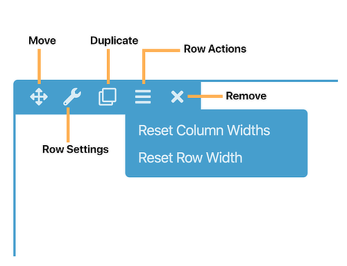
Options you can choose from:
- Move the row by clicking the Move icon and dragging it.
- Edit the settings by clicking the Row settings icon.
- Duplicate the row.
- Reset column widths for the entire row or Reset row width , which resizes the row to its global setting.
- Delete the row.
Row Style Tab
Click the Row settings icon for a row to display the Style tab. You can make the following changes on the Style tab.
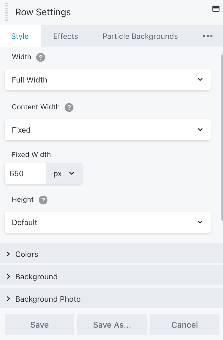
1. Row and content width and max width fields
When you add a row to your layout, the initial width settings are the default width. If you want the row to have a background color or background image, in the Width field, set the row width to Full width. If you’re row won’t contain any background styles, keep the row width set to Fixed.
For fixed-width rows, choose a maximum row width in the Fixed width field. Maximum width means the row can become less wide when the screen size shrinks below the max width, but can’t become wider as the screen grows larger.
2. Row height
Set the row height to one of the following values:
- Default
The row height automatically sizes according to the row content. - Full height
The row fits the browser window. You can align the content to Top, Center, or Bottom. - Minimum row height
Set the value you want for minimum height. Use this in cases in which you want the row height to be greater than the default but less than the full browser window height. You can also choose the vertical alignment of the content in the row: Top, Center, or Bottom.
3. Colors section
Override default color settings for text, link, and heading colors.
→ TIP
Here’s why it’s handy to change text color in row settings rather than module settings. Suppose your default text color is black, but you want a dark background for your row, so you want all the text in the row to appear in white. By setting text color on the row, you don’t have to set it for each module. In addition, when you move modules around, any module moved into that row will automatically have the right color text. If you change text color in a row setting, you can still override that by setting another text color in a module.
4. Background section
Create and style any of the following types of row backgrounds. Each choice opens a section with settings for that type of background.
- None
- Color
- Gradient
- Photo
- Video
See the article about row background video settings and tips. - Embedded code
Use HTML to embed content such as videos from other sources or sliders from other plugins using shortcodes. - Slideshow
- Parallax
See the article about parallax row backgrounds.
5. Background overlay section
This section appears if you choose Photo, Video, Slideshow, or Parallax as the background type. You can select a color overlay and manipulate the opacity to show more or less of the underlying background.
Usually a background color overlay is done using a semi-transparent white or black color to improve legibility of content on top of the row background, but in some cases a semi-transparent color is used for design effect.
6. Border section
You can add a row border. With or without a border, you can add a corner rounding (radius) and a shadow effect. See the article about borders and the article about radius and shadow effects.
7. Top shape, Bottom shape sections
Assign a shape overlay to the top or bottom edge of the row. See the article on row shape overlays.
Next, we’ll navigate to the Advanced Settings Tab by clicking the 3 dots and selecting Advanced. See options and settings for this tab below.

8. Advanced Settings: Spacing
You can lock the four margin and padding settings so that you can enter one value into any field and all four settings (left, top, right, bottom) show that value. Click the Lock icon, circled in orange, to lock the settings and click it again to remove the lock:

Using the icon circled in blue, you can add settings for each device size or let Beaver Builder handle the smaller devices automatically. Start with this article for information about margins and padding before you start making individual changes on the Advanced tab.
9. Advanced Settings: Visibility
In the Breakpoint field, you can limit the display of the row, column, or module to particular device sizes. See this article for more information about global and custom breakpoints.
In the Display field, you can choose to display the row, column, or module always, never, or only to logged-in or logged-out users. NOTE: This is especially useful if you have a section you need to hide temporarily. FOr example, let’s say you have a text module about a Job Opening, but the position has now been filled or closed. But you know more Job Openings will be added later. You can choose to either replace the text to say “No Openings” or you could hide the entire section until you need it again.
10. Advanced Settings: Animation
You can assign an entrance animation, which activates the first time the page is loaded and the row, column, or module comes into view. The default is None.
If you choose an entrance animation, set the delay (how long before the animation starts, in seconds) and a duration (how long the animation lasts, in seconds.)
11. Advanced Settings: Custom Classes & ID’s
Add a CSS ID or class value to the row, column, or module.
ID names must be unique on a page, so assign an ID only when you need to reference that unique ID. For example, a link to an anchor on the page requires a unique anchor so it know exactly where to go. Class names are usually intended for reuse and are often used in CSS rules. For example, you might want to assign a different text size to all HTML headings with an fl-heading class.